A funny thought came to me today. Perhaps we could see what people love by how many times Google caught them expressing it. Here are the results of a few simple queries:
Results 1 - 20 of about 35,800 for "I love windows"
Results 1 - 20 of about 79,900 for "I love linux"
Results 1 - 20 of about 371,000 for "I love ubuntu"
Results 1 - 20 of about 445,000 for "I love sex"
Results 1 - 20 of about 763,000 for "I love life"
Graphically, it looks like this:
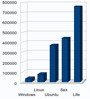
As a percentage of those who [publically] love life, 58.3% love sex. 48.6% love Ubuntu, which is almost five times as many as those who love Linux in general (10.4%). Compare that to the 4.7% of people who love Windows.
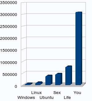
So what do people love the most? The only result that I found scoring higher that life was, well, you! A staggering 3 million people love you:
Results 1 - 20 of about 3,090,000 for "I love you"
That's over four times the amount of people who simply love life. Amazing. Here it is, graphically:
What can I conclude from this? Just the obvious. Windows is terrible, Linux is a bit better, and Ubuntu is saving the PC. Sex is better than any of them, but what's best? You are!